
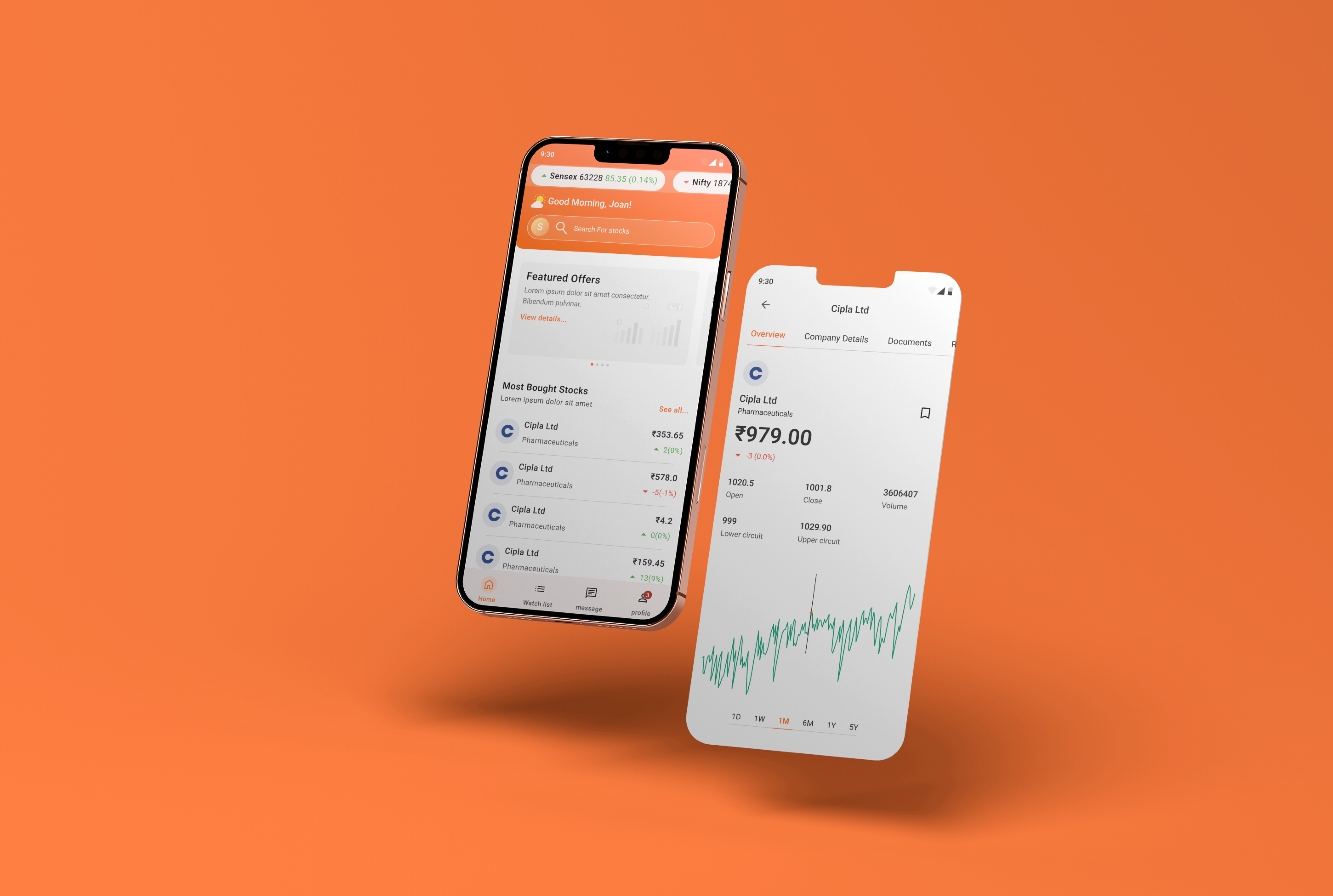

Website Design
(UX/UI)

Website
Devlopment

Search Engine
Optimization

Content
Writing


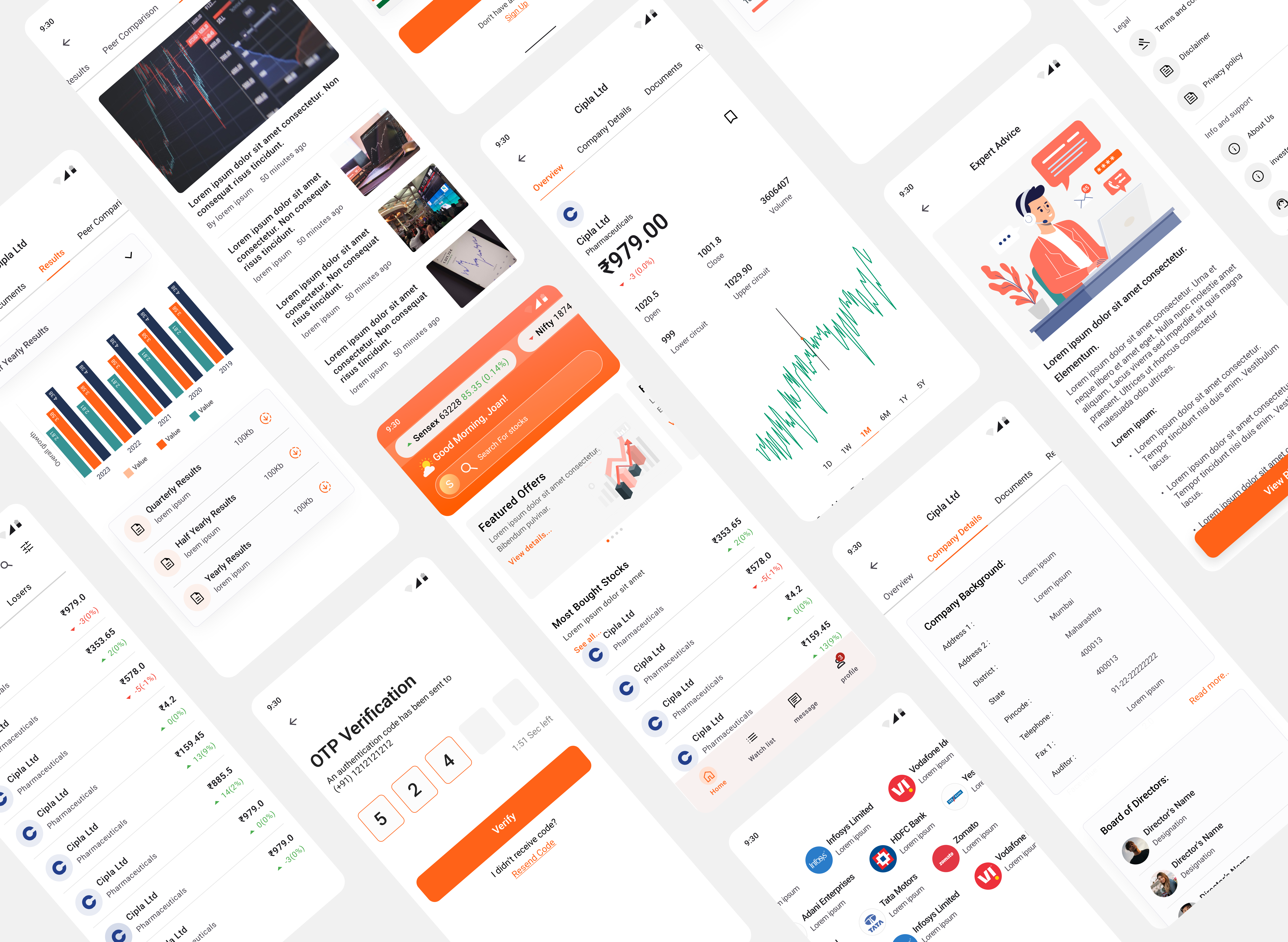
Website Design
(UX/UI)
Website
Devlopment
Search Engine
Optimization
Content
Writing